Genesis Energy – Website Redesign
Redesigning around three distinct audiences, and giving content teams a modular system they own
As UX/UI Lead I owned the UX and UI for the redesign of Genesis Energy's marketing site. The brief was a re-platform. I made the case that it was also our only realistic window to fix the structure underneath, and the team backed it. Working from a content audit that surfaced 96 live pages, I rebuilt the information architecture and validated it with 176 participants, art directed the refreshed UI with a Senior Designer, and took the business through what was changing and why. The result is a modular system content managers now run themselves, and a storytelling framework that lets Genesis talk openly about Huntly, renewables and energy security.
MY ROLE
UX/UI Lead
PLATFORM
Web (responsive)
TIMEFRAME
2021 - 2022
TEAM
Me + 1 Senior Designer, Engineering & Content Managers
VISIT SITE
genesisenergy.co.nz
SKILLS
Hands-on UX/UI · Design Systems · Customer Research · Design Direction
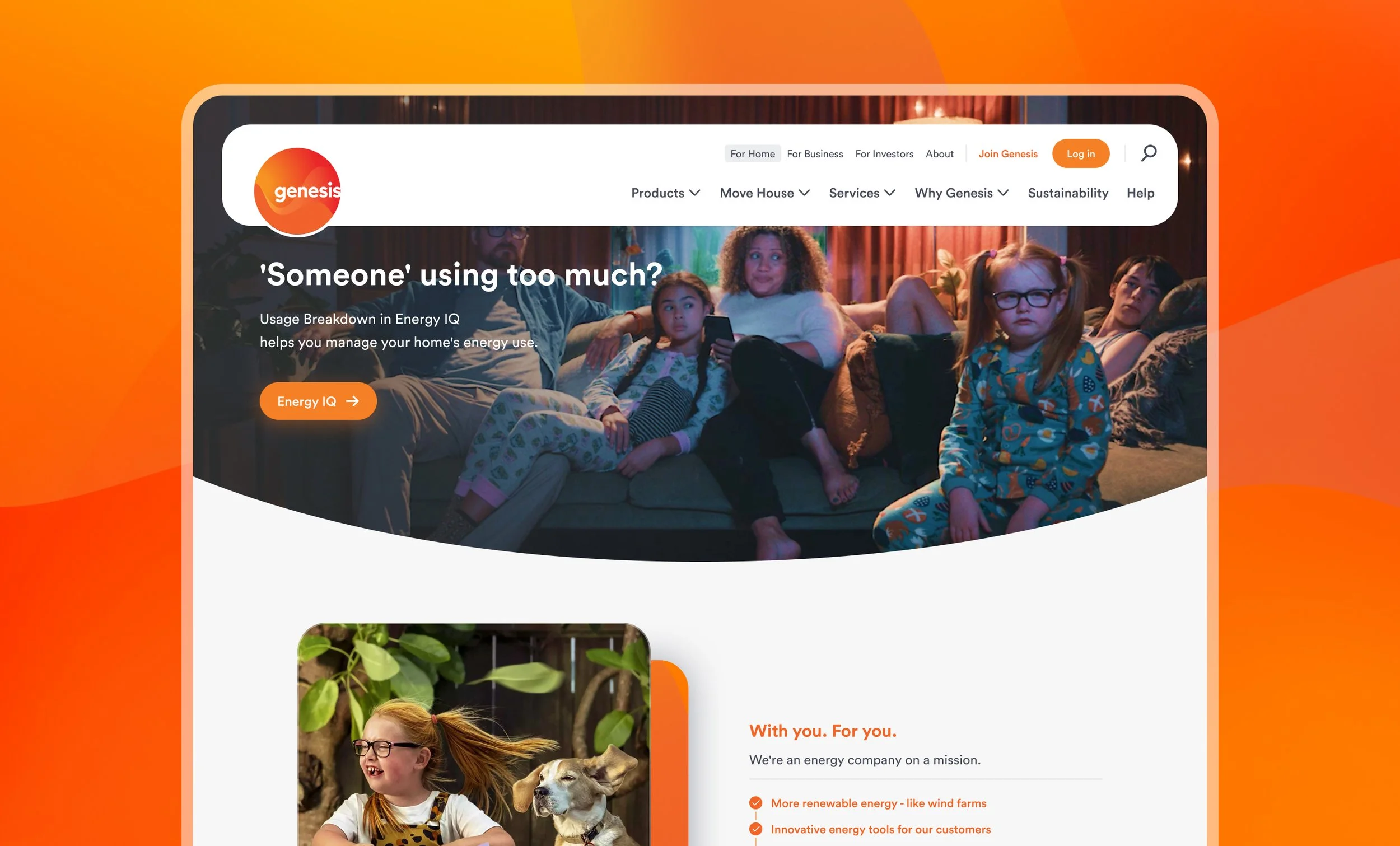
The rebuilt genesisenergy.co.nz— three clear audience paths, a premium visual language, and every page assembled from the same component set.
01 –THE PROBLEMA site nobody could navigate, on a stack nobody could maintain
The situation
Genesis was moving to a modern technical stack, and the marketing site had to move with it. But the site had grown by accretion — years of teams adding pages without anyone removing them. A content audit found 96 live pages, many duplicating or contradicting each other. Every new page needed design and development effort, so the content team was permanently bottlenecked and the brand looked inconsistent from one section to the next.
What customers felt
Three very different audiences — residential, business and investors — were funnelled through one undifferentiated structure. Customers trying to do simple things, like move house or pay a bill, had to guess which of several similar-sounding pages was the right one. Meanwhile the stories Genesis most needed to tell — about Huntly, renewables, energy security — sat buried in dense pages that no template was built to carry.
THE EVIDENCE96 live pages found in the content audit, with substantial duplication and overlap across sections.
176 participants across card sorts and tree tests confirmed people could not reliably predict where content lived under the old structure.
3-4week turn around under old process for every new page required bespoke design and build, too slow for the stories we wanted to be telling
THE CHALLENGEHow might we rebuild the site so three audiences each find their own path, and so the people who maintain it can tell complex stories without a designer?
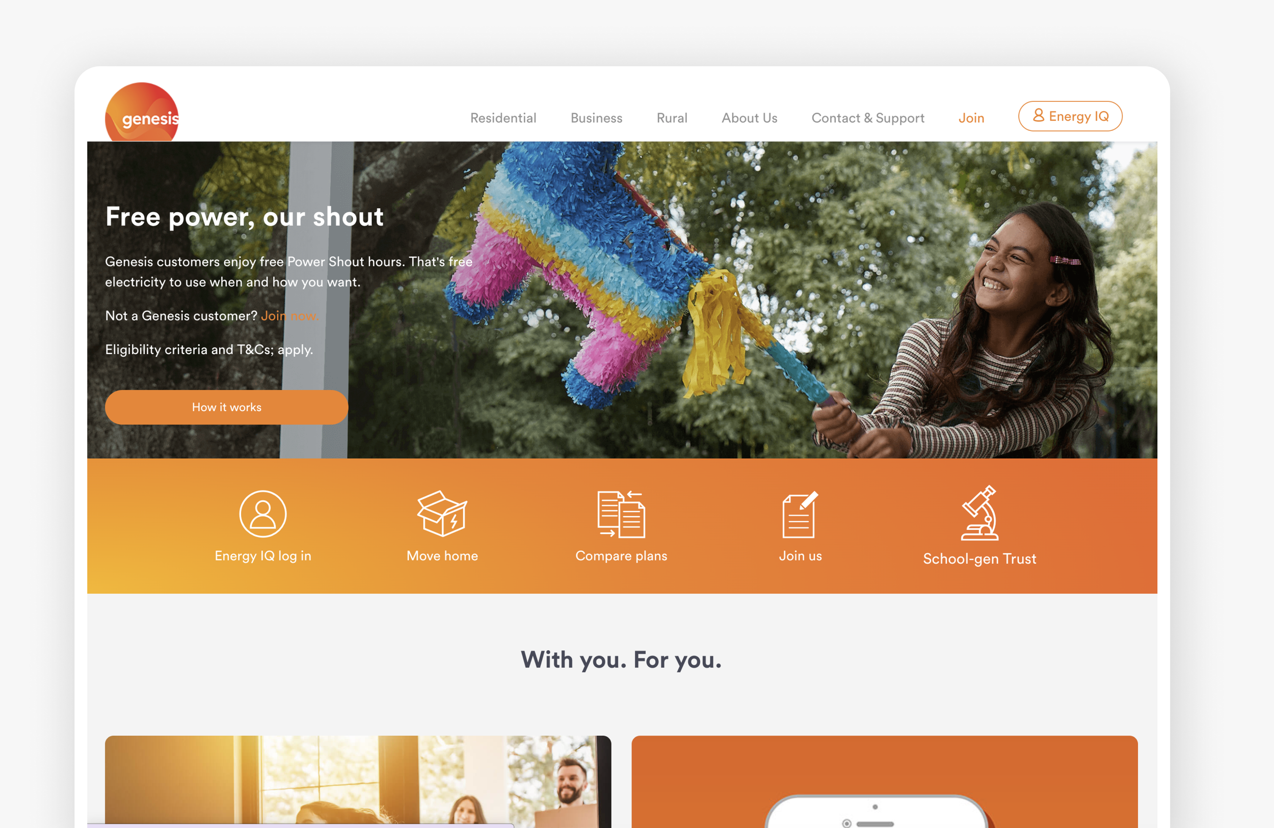
The old website wasn’t serving our three audiences well and was confusing to navigate
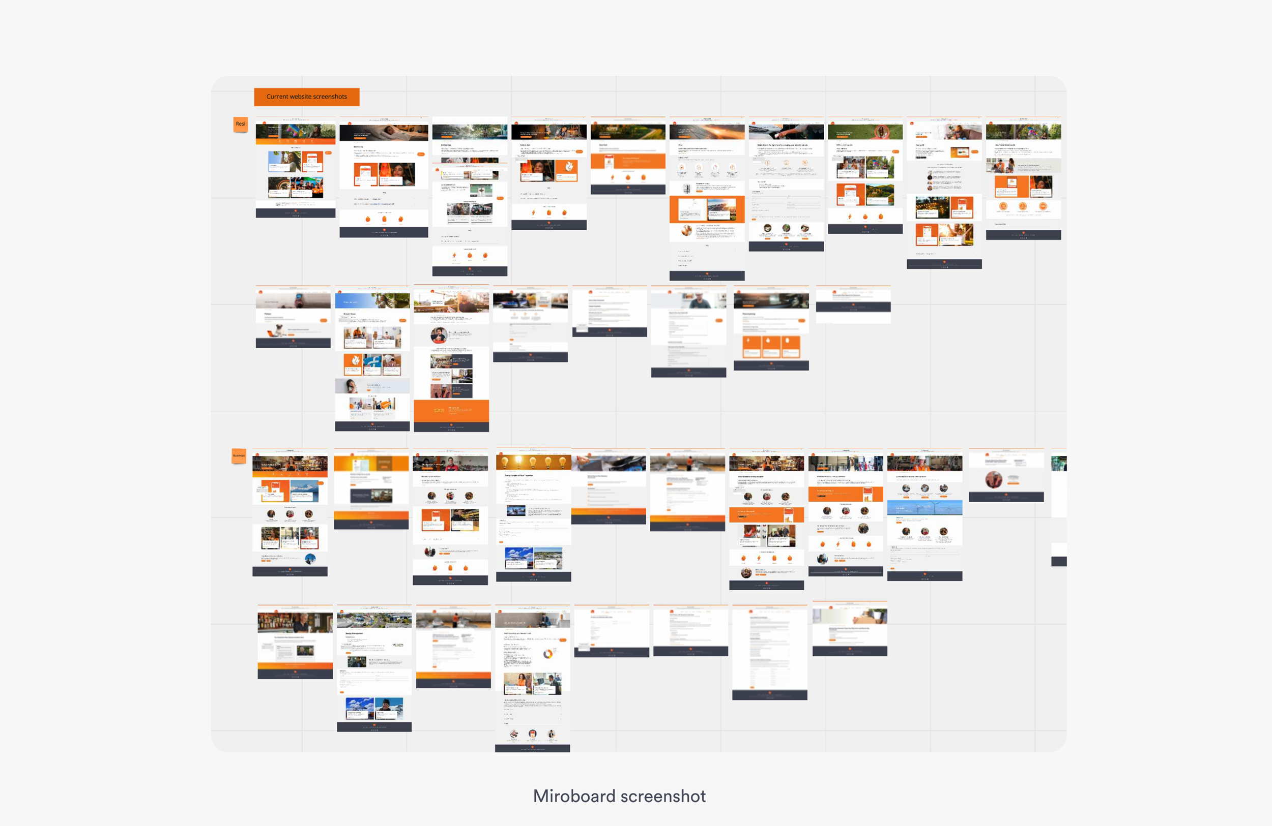
Content audit surfaced almost 100 pages, many duplicating and overlapping information
02 — MY ROLESetting the direction, doing the research, and bringing the business with us
This shipped because a small group covered a lot of ground: a Senior Designer, the engineering and content teams, and myself. Here's the part I carried.
I LEDMade the case for reframing a re-platform brief into a restructure
Owned the storytelling framework for sustainability content
Presented the new experience back to internal stakeholders and brought them with us
I DIDIA restructure and navigation model, built on the content team's audit
Card sorts and tree tests with 176 participants: design, analysis, readout
Defined the page template set
Art directed the refreshed look with the Senior Designer
I DIRECTEDLanded the new visual direction, then handed off to the Senior Designer to produce the full component set
Ran critique and held the quality bar with the team
Worked with engineering so the system and front-end stayed in sync
The hardest problem was organisational, not technical: every business unit wanted its own page and several wanted the homepage. Rather than negotiate page by page, I put the tree test data in front of everyone so we were all looking at the same evidence. I then presented the new experience back to each stakeholder group, walking through the improvements and showing how their audience was better served under the new structure.
Structure first: nothing visual started until the IA held up
03 — THE PROCESSFive phases. The content team gave us the raw picture, I took the structure through to validated, and the visual system was shared work with the Senior Designer and engineering.
PHASE 1Audit
The content team audited the site and surfaced 96 live pages mapped against purpose, audience, traffic and overlap. It was the first single view anyone had of what the site actually contained, and it became the most persuasive artefact of the project. I used it as the evidence base for arguing that we consolidate before we migrate.
PHASE 2Restructure
I rebuilt the IA around Residential, Business and Investors rather than the internal org chart the old site had inherited, and worked through the merges with content owners so duplicated pages became single sources of truth.
PHASE 3Validate
Build, then cut
I tested the proposed structure with 176 participants via card sorts and tree tests, focused on high-volume journeys like Moving House and Pay My Bill. Both returned strong success rates. It meant the structure arrived at stakeholder review with evidence attached, which made the conversation a much easier one for everybody.
PHASE 4Art direct
PHASE 5I worked with the Senior Designer to land the refreshed look, exploring directions together until we had one that held the brand's premium position and worked across every template we'd defined. Once the direction was settled I handed off to him to produce the full component set, which kept the craft consistent and let me stay on structure and stakeholders.
The reversal. Our first component set was too generous, a call I'd backed. More options didn't mean more flexibility; it meant content managers couldn't confidently choose, and every ambiguous option was a chance to break consistency. So we cut it back together: fewer components, each doing one job, with clear rules about where it belonged. The reduction is why the system got adopted.
THE PRINCIPLES WE WORKED TOOne page, one source of truth – Consolidate before you migrate.
Design for the person who maintains it – If a template needs explaining, it isn't finished.
Every template carries a story – Complex topics are a core case, not an exception.
04 — THE SOLUTIONI set the direction on each of these. The Senior Designer produced the components and the engineering team built them.
Three moves that made the site simpler to use and simpler to run
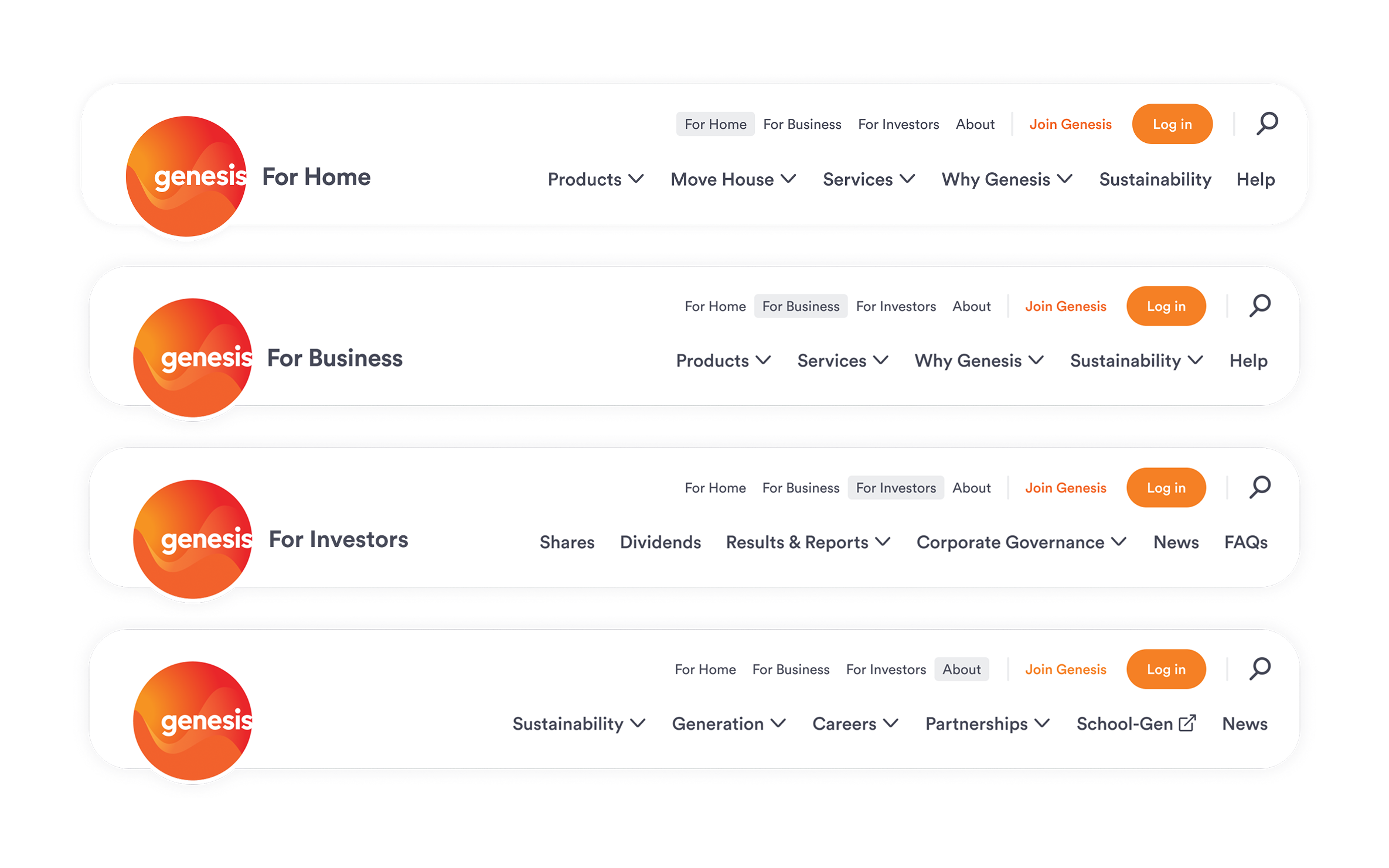
01Each audience gets a purposeful path in, rather than filtering through a structure built around internal teams. We accepted a slightly heavier top-level nav in exchange for far shorter paths once someone is inside it.
Three doors in, not one hallway

02Content managers assemble pages from a small, tested component set. Each block carries its own rules for spacing, hierarchy and behaviour, so a page built by someone with no design training still comes out on-brand. Page creation moved from a project to a task.
Lego blocks, not bespoke pages

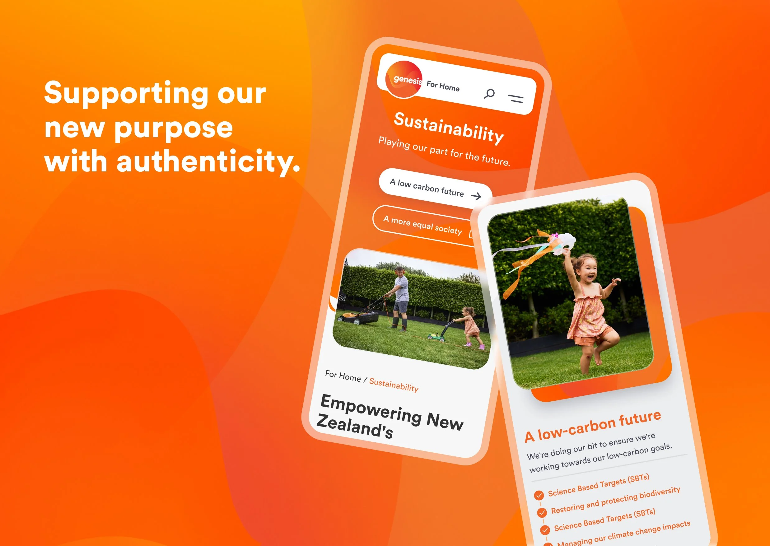
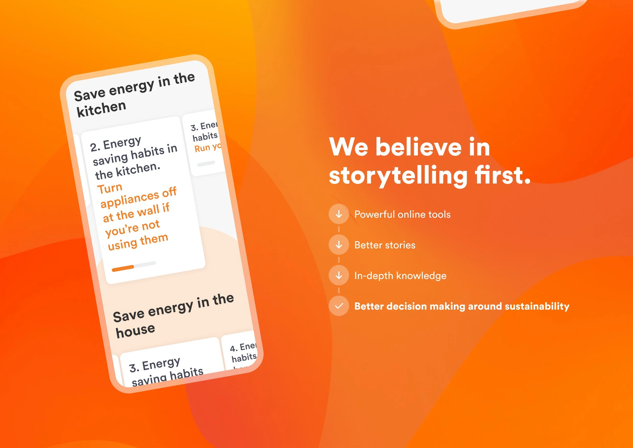
03Rather than treating long-form sustainability content as an exception, I pushed for it to be a core template case. The layouts pace a complex argument: clear entry, room to explain, space for imagery to do work the copy can't. Working closely with the content and brand teams on what these stories actually needed to say shaped the templates as much as the design did.
Templates built to carry a story
05 — THE IMPACTA faster site, a cleaner structure, and a content team that can move without us
The design system outlived the project. Page creation became something the content team owns, which moved design effort away from producing pages and towards strategic work. The storytelling framework did the same for communications, giving the business a repeatable way to lead difficult public conversations about renewables while being honest about energy security.
BEYOND THE PROJECT“Building new pages is so much faster and more enjoyable now. No more 4 week turn arounds, now we can get a new page live within days to a high standard”