
Genesis Energy – App Redesign
Turning rich data into actionable power insights for diverse, busy audiences
As Lead Product Designer, I played a pivotal role in the redesign of Energy IQ, Genesis' primary digital engagement platform. Our goal was to deliver a more personalised, valuable and emotionally connected experience that deepened customer relationships, improved self-service, and proved the brand promise: With you. For you.
We stopped designing around the account and started designing around the home, so that the data customers were already generating became something they could see, understand and act on.
MY ROLE
UX/UI Lead
PLATFORM
Web App (responsive)
IOS + Android
TIMEFRAME
2021 to 2022
TEAM
Internal Genesis product squad
Strategic design partner Ghost Dynamics
3D animation studio Nyuk Nyuk
VISIT SITE
Energy IQ
SKILLS
Hands-on UX/UI, Design Direction, Art Direction, Customer Research, Design Systems, Accessibility
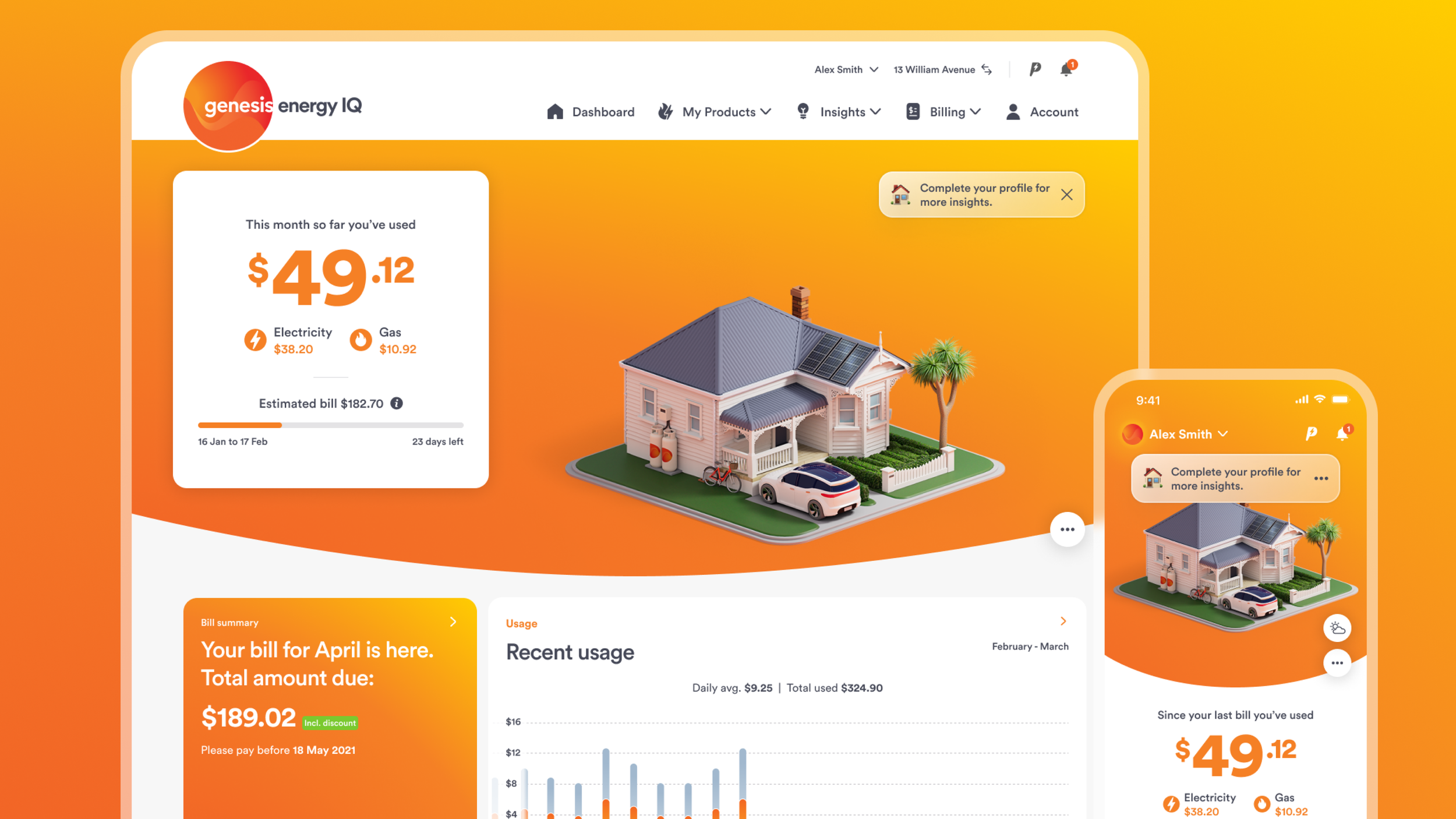
The redesigned dashboard puts the customer's home at the centre, with services, usage and offers arranged around it.
01 –THE PROBLEMAn app people opened to pay a bill, then closed again
The situation
Energy IQ was Genesis' main digital front door, and the business was betting on it to carry self-service, retention and the shift into new energy products. In a market where switching is easy, low engagement leads directly to churn. But the dashboard treated every customer the same. It was built around a single account on a single property, which left multi-property and multi-fuel customers, some of the most valuable customers under served.
What customers felt
Customer feedback was blunt. The app felt boring and transactional, with little reason to open it beyond paying a bill. The frustrating part was that Genesis already had the data. It could predict a household's daily spend with real accuracy, and it had a large tips centre full of ways to save power. Customers ignored both. The value was there and none of it was legible to a busy person holding a phone.
THE EVIDENCEPredicted spend was shown daily, but customers think about power monthly. They had no mental model for whether a daily figure was high or low.
The tips centre was well stocked and rarely used. Customers found the tips reasonable but could not gauge the impact of any of them, so none of them felt worth doing.
Genesis segmented customers demographically, into groups like 'older people' and 'young families'. Those segments described who customers were and nothing about what they would do, so they could not be designed against.
THE CHALLENGEHow might we make a utility app worth opening when there is no bill to pay?

The old dashboard was clinical and busy with alot of valuable data but too complicated to interpret and action.
02 — MY ROLEThe client-side design lead: the person in the room who had to live with the decisions
This was a genuine partnership. Ghost Dynamics led the strategy definition and collaborated with our internal design team on execution, Nyuk Nyuk built the 3D world, and our squads carried it into build and beyond. My role was to act as Design Lead from the Genesis side: the decisions, the product direction, the design direction, and the standard the work was held to.
I LEDThe design decisions. Where the experience went, what earned a place on the dashboard and what did not, how insights were structured, and how the complex customer types were handled. I ran critique on the agency's output, worked in the files when a decision needed resolving rather than describing, and signed off what shipped.
I DIRECTEDThe agency design team day to day, and the art direction with them. We explored directions together and I made the call on the look, then set the brief with animation studio Nyuk Nyuk for the 3D homes. I was also the connective tissue between the partners and our internal stakeholders across product, marketing and technology.
I PROTECTEDWhat gets quietly dropped under delivery pressure. Accessibility as a design input rather than a retrofit. A design system built as we went, so we ended up with reusable pieces instead of finished screens. And the edge cases: multi-property and multi-fuel customers, who are complex, valuable, and easy to design past.
I was the glue on this project. Three organisations were working at once, each with its own pressures, and none of them had the full picture. I made sure the agencies had the context, access and decisions they needed to do good work, and that our internal stakeholders in product, marketing and technology were getting what they needed back, in the terms they cared about. Most of the value in a partnership like this is lost in the gaps between the parties. Closing those gaps was a large part of the job, and it is the part that never appears in a deliverable.

Five phases, run over two years alongside continuous release
03 — THE PROCESSGhost Dynamics led the strategy definition and their designers produced most of the output. I led the design decisions throughout, and was in the research, the workshops, the critiques, the testing and the stakeholder sessions from start to finish.
PHASE 1Getting close to what people actually wanted
We ran customer interviews across a spread of household types, and I made sure multi-property and multi-fuel customers were in the sample rather than treated as an afterthought. They are complex, they are valuable, and the old dashboard ignored them completely. The question was not what people wanted added to the app. It was what would make them open it in a week where nothing was due.
The most useful finding was about segmentation. Genesis grouped customers demographically, but an 'older person' can be tech-confident or tech-wary, and you cannot design a feature for a birth year. The research replaced those demographic segments with four behaviour-based ones for the digital channel. The group that worried the business most were the Passive customers, a large segment who wanted almost nothing to do with their power company because they were simply too busy. That disengagement is what precedes churn.
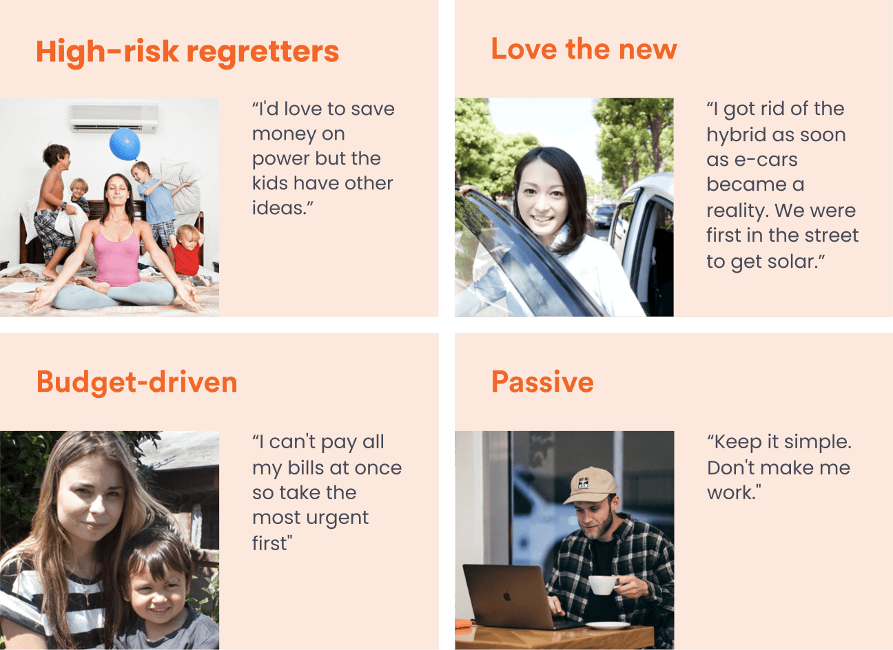
The four behaviour-based segments that replaced the demographic ones.
What it changed: It killed the feature-led brief and gave us a single unifying motivation. Every segment, including the passive one, aligned on saving money. If we could show people how to spend less without making them think hard about it, even the least engaged customers would open the app. That became the strategy.
PHASE 2Turning strategy into principles the team could decide with
The research fed a set of Digital Design Principles, developed in workshops across product, marketing and technology. What I pushed for was principles a designer or a developer could hold a screen against and get a clear answer from, because principles that only sound good in a deck do not survive a sprint. I also made sure they covered the customers who are easy to forget, not just the straightforward ones. Once they were agreed, they became the basis of every critique I ran with the agency team.
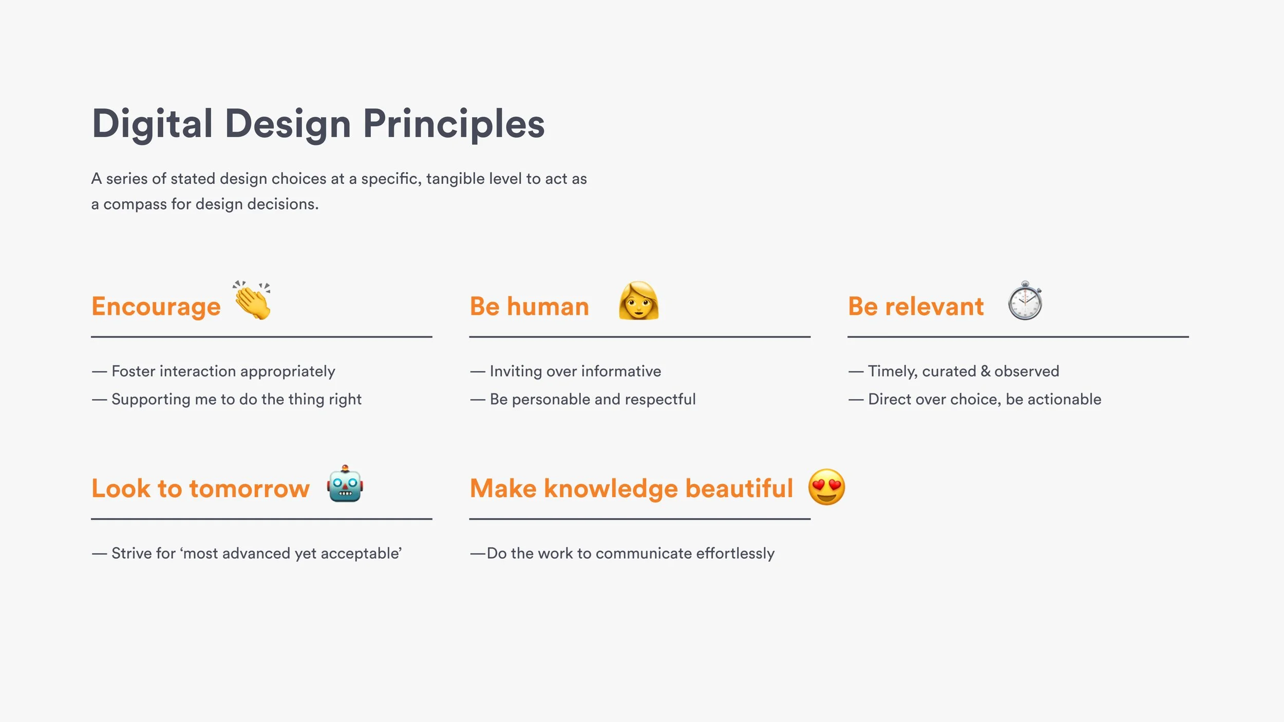
What it changed:Design debate moved from opinion to principle. It also gave the squad a way to say no to good ideas that did not serve the customer's situation, which mattered more than any single screen we designed.
The workshop output. Getting the business to co-author the principles is what made them enforceable later.
PHASE 3Putting the home at the centre, and making it look like ours
The reframe that unlocked the redesign was to stop designing around the account and start designing around the home. An account is an administrative object. A home is where people actually experience energy, and it is the thing a multi-property customer needs to tell apart. Everything else arranges itself around a house: usage, services, offers, insights.
Making that real meant getting the house right. I art directed this with the agency team, exploring directions together and making the call on the look, then set the brief with animation studio Nyuk Nyuk. The decision I pushed hardest on was the styles of home we offered. A render can be beautiful and still fail, if a customer in a 1970s brick and tile looks at an architectural showpiece and sees somebody else's life. The houses had to be recognisably New Zealand, and they had to cover the range of how people here actually live.
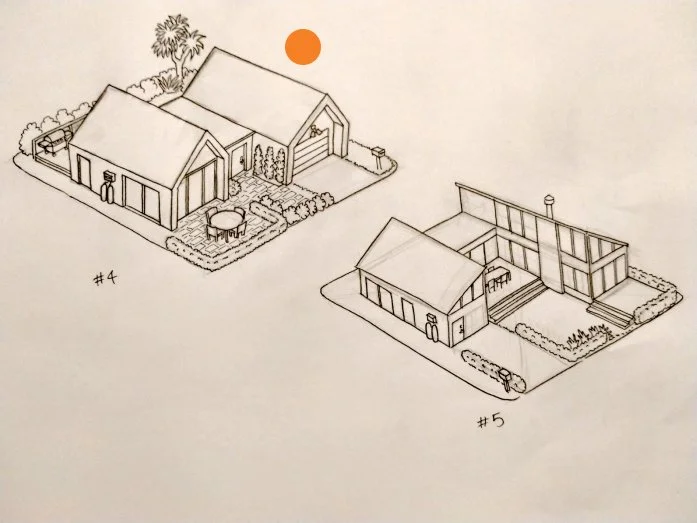
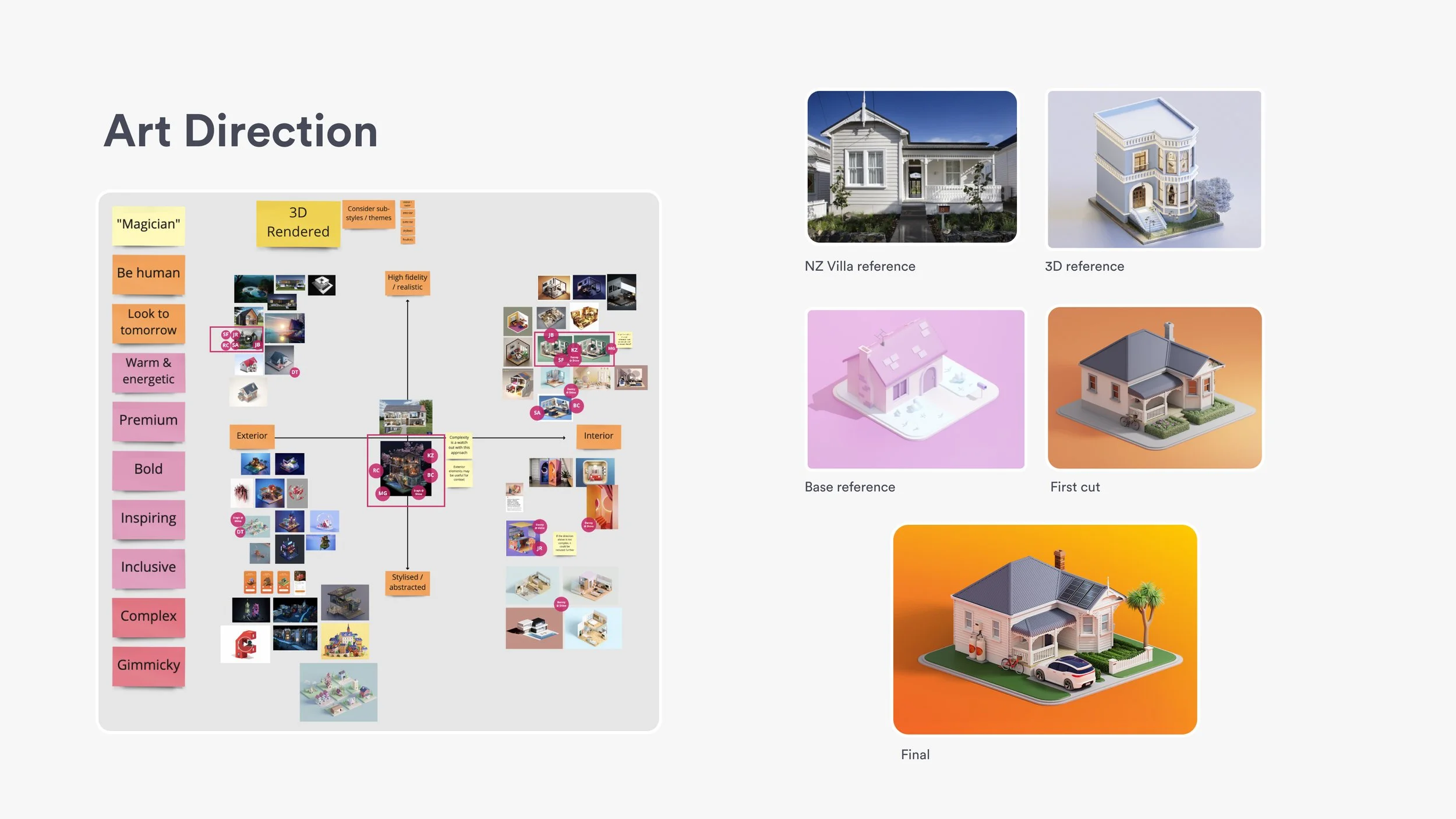
House explorations with Nyuk Nyuk. The selection question was not which house is most beautiful, it was which houses our customers would claim as theirs.
What it changed: Customers choose a 3D house when they sign up, and it carries their EV, solar and gas as they add them. It tested well, and it does something a chart cannot: it puts usage where it actually happens. Structuring around place rather than account also solved the multi-property and multi-fuel problem properly, instead of bolting a switcher onto a dashboard that was never built for it.
PHASE 4Testing before we built
We tested prototypes with customers ahead of each significant release, and I took the findings into the stakeholder sessions and into the next round of design decisions. Showing a senior group a recording of a customer mistaking a spend forecast for a weather widget ends an argument faster than any amount of rationale, and it is how several contested decisions got settled.
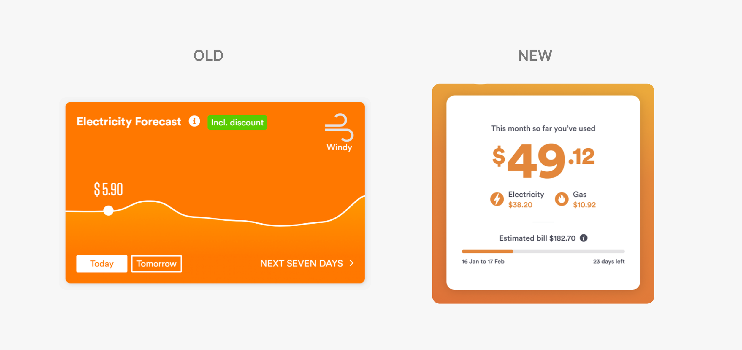
The old tile and its replacement. Customers told us the daily figure was meaningless to them and as they thought about their spend in monthly bill terms.
What it changed: Testing rewrote the predicted spend feature. Customers told us a monthly forecast would be far more useful than a daily one, because it gives them a chance to see a high bill coming and change something before it lands. We moved from a daily to monthly (used so far) and estimated bill model.
PHASE 5Building something the squad could carry after us
An agency engagement has an end date. The product does not. So while the redesign was in flight I had us build the design system as we went, rather than assemble a library retrospectively out of whatever had shipped. Every new pattern came with a decision from me about whether it was a one-off or something the squad would reuse, and answering that at the time is far cheaper than answering it a year later.
Accessibility went in the same way, as an input to design decisions rather than a compliance pass at the end. Contrast, type size, target size, and whether an insight still made sense without its animation or colour coding. This app is used by everyone who buys power, which is a broader group than any product team's mental image of its user.
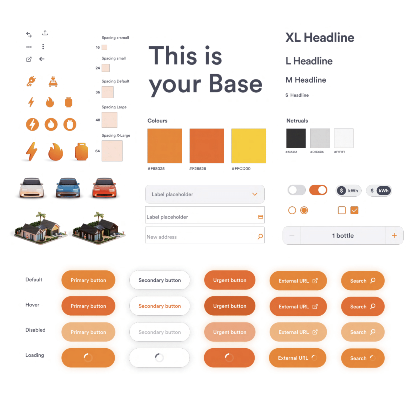
Components built as system pieces rather than screens. Deciding reuse at design time is what kept the library honest.
What it changed: The squad came out of the project with a system it owned rather than a set of finished screens, which is why feature delivery kept moving after the engagement closed. It also created real efficiencies for the product squad, since new work started from existing pieces instead of a blank canvas.
04 — THE SOLUTIONA dashboard built around a home, not an account number
Five moves carried the redesign. I made the call on each of them and directed the agency team through the production, holding every one against the same two questions: does it hold up for a real customer with a complicated life, and can the squad build on it afterwards.
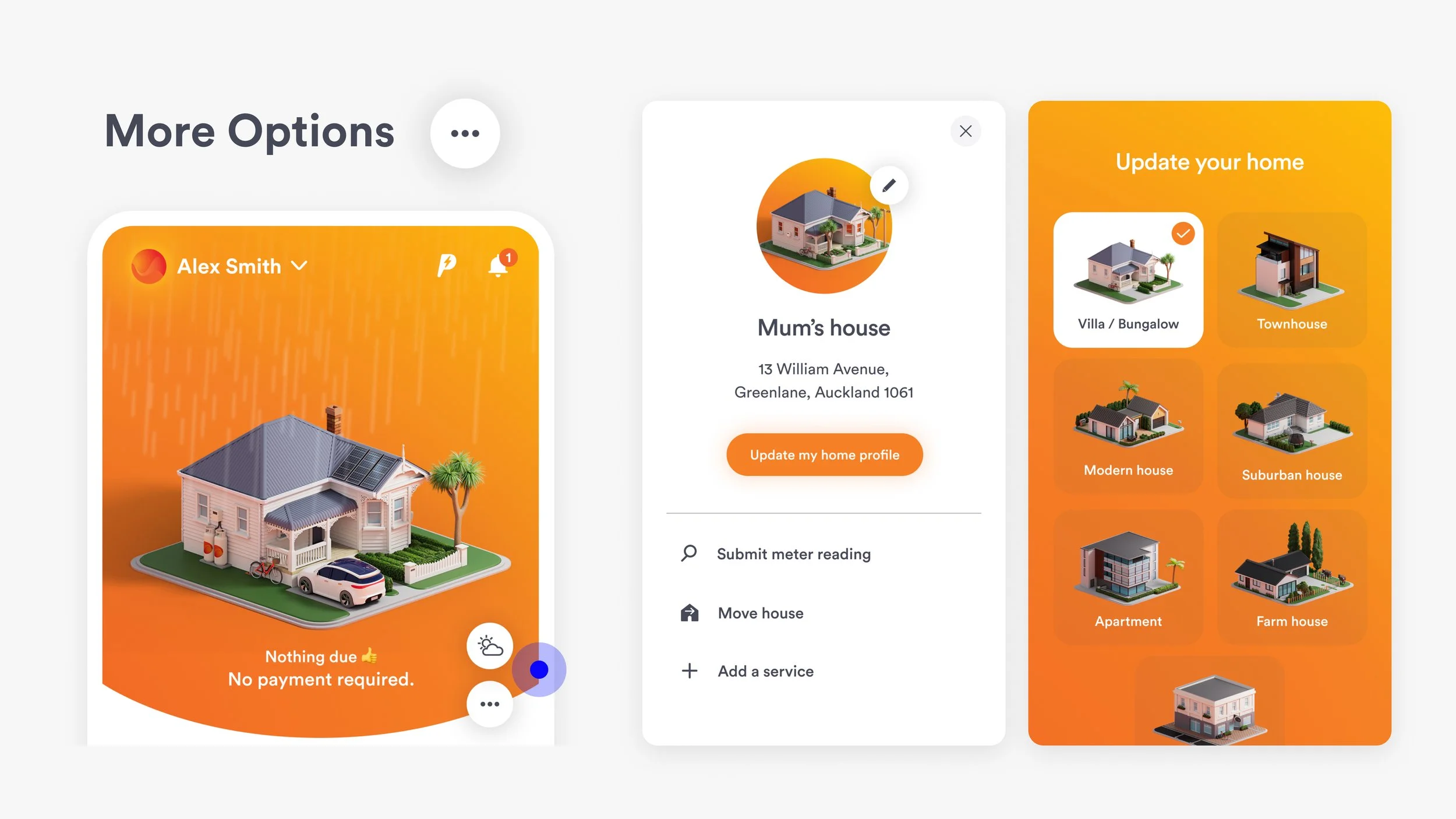
01A house you choose, not an account you were given
We made the customer's home the organising object of the whole experience, with energy services, usage insights and personalised offers wrapped around it. Customers pick a 3D house avatar when they sign up, and it grows to show what they own: an EV, solar panels, a gas tank. For customers with more than one property, each home is its own context rather than a filter on a shared view. The animation and micro-interactions around it had one rule, which was that motion has to serve comprehension or feedback. If removing it cost the customer nothing, it went.
02Two things were wrong. The connection between cold weather and a higher bill was never made visible, so customers saw a forecast rather than a warning. And the prediction was daily, while people think about power monthly, which left them with no way to judge whether a number was high or low. We moved to a monthly forecast, which customers themselves proposed in testing, and tied the weather visibly to the house. Monthly gives someone more chances to see a high bill coming and do something about it.
A monthly forecast, not a daily number

03Dense text and heavy detail meant customers had to invest time before they got anything back, and the busiest segments, roughly 57% of the market, would not pay that cost. So we structured every insight in three depths. A bite is the headline you can absorb in a glance, a snack adds enough to act on, and a meal is the full detail for people who want it. The customer chooses their level of engagement rather than the interface choosing for them, and it flexes across mobile, tablet and desktop.
Bite, snack, meal
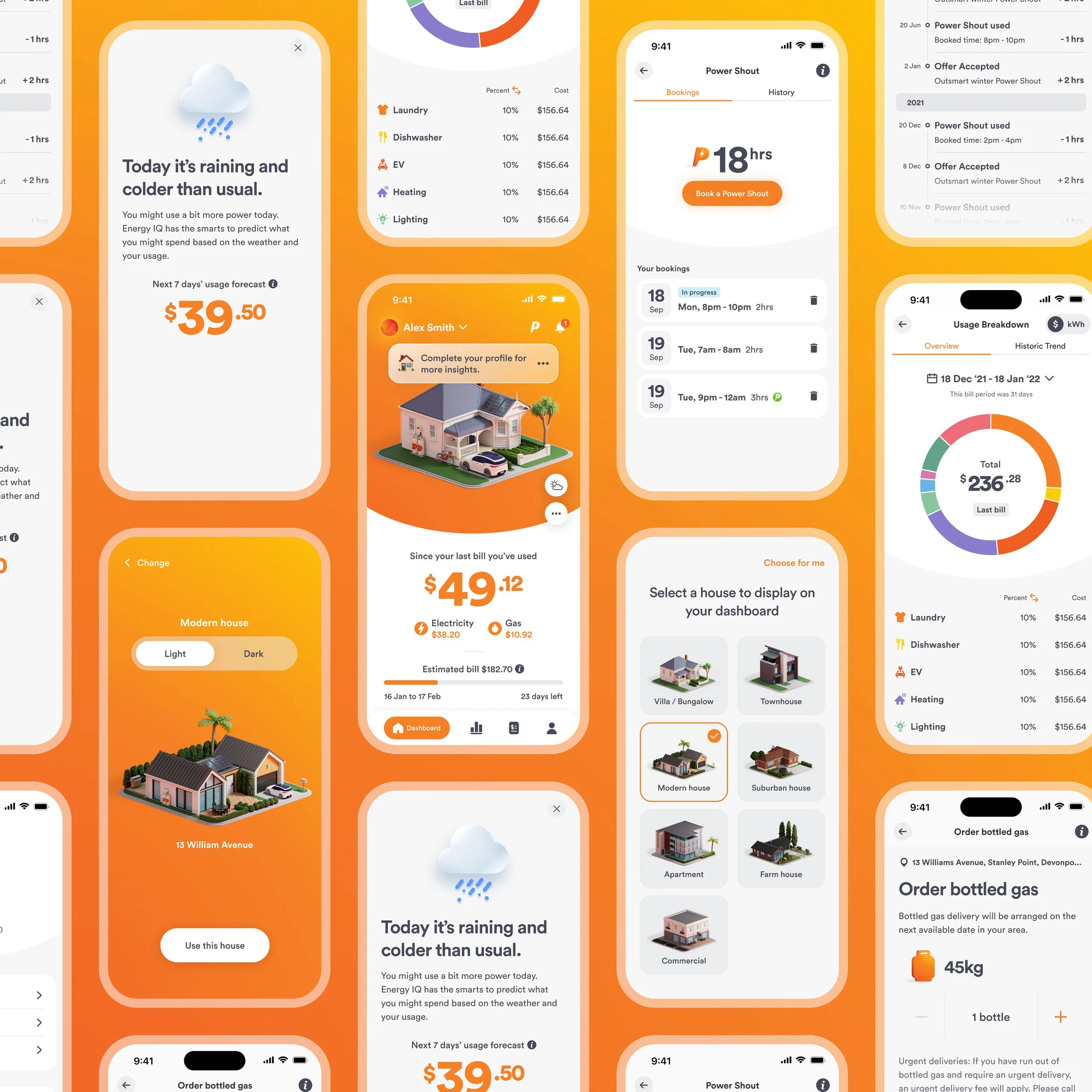
05We added light game mechanics to make consumption tangible and give people a reason to return between bills. This is also the move we over-invested in, and the one we later pulled back to make room for the fundamentals. What survived is the version that supports the core tasks rather than competing with them.
Gamification, kept light
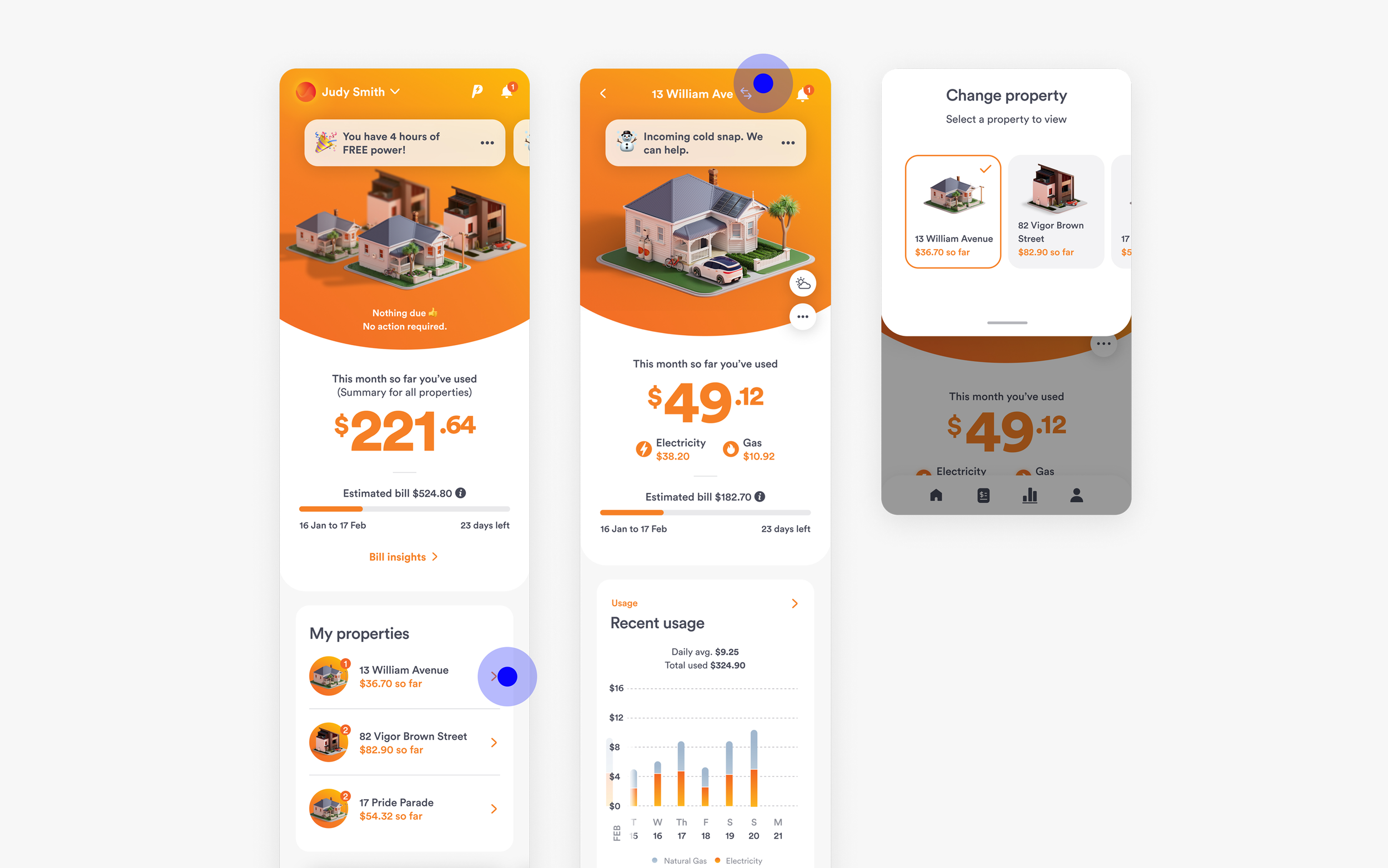
04We built the experience so that products, insights and services surface according to each customer's actual situation, rather than showing everyone everything. This was the commercial engine of the redesign as much as the customer one. Relevance is what makes a cross-sell feel like a service instead of an ad, and it is what let Genesis keep adding features without the app turning into a catalogue.
Personalisation that earns its space

Customers came back, and they said the app was saving them money
05 — THE IMPACTEngagement has grown year on year since launch, which in a market where switching is easy means the app is now doing retention work rather than just billing work. The redesign proved the commercial case for Energy IQ inside the business and changed how it was funded and prioritised.
Three things outlived the project. The behavioural segments replaced demographic ones as the way the digital channel thinks about its customers. The Digital Design Principles kept working after launch, giving the squad a shared basis for decisions. And the design system meant the squad kept its momentum once the partners moved on, building from components it owned rather than starting each feature from nothing. Faster, more engaging self-service created real efficiencies for the product squad and the business behind it.
BEYOND THE PROJECT“The app is genuinely useful, nice layout and lots of different tools to help you track your spending”